VAULT is a startup crypto digital wallet app.
Brand Identity/Logo Design/Social Media Positioning and Marketing
Challenge:
Design Brief: Vault is a cryptocurrency trading platform that is looking to distinguish itself from current competitors with unique visuals.
Strategy:
Leaning toward creating a visual logo that captures the idea of security and interlinking symbolizing the blockchains that crypto uses?
For social media strategy and templates, I wanted to create some visuals that represented the blockchain linking and the connectivity of those blocks as a background. The main focus for the templates is for consumer awareness and CTA to download the app.
Concept Development:
Searching for the right logo icon was a difficult challenge. Starting with manipulating the "V" and trying to create a simple visual cue as to the company's purpose.
I started really complex and realized I needed to simplify it down. It needed to be read instantly no matter the size.
I abandoned the "V" concept and thought specifically what visually says exactly what the product does. It's a "vault" for your blockchain investments. From there creating locks to signify "security" and linking them in a frame around the center lock icon.
Below are the early concept designs I explored but eventually decided to scrap. These designs were too visually far away from the company's concept. They lead the customer to guess rather than instantly know what they are looking at. Still fun to explore these concepts.

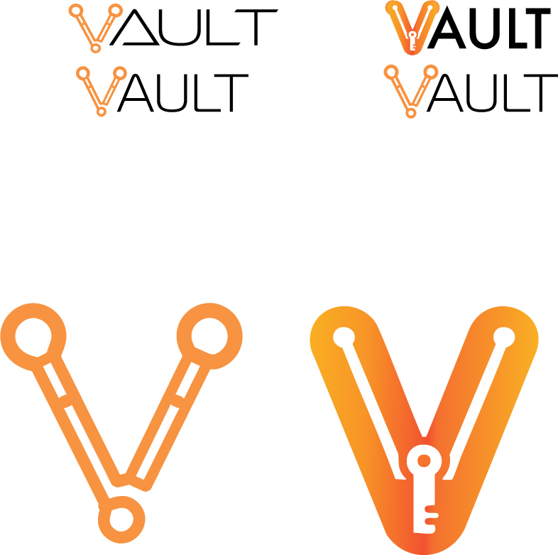


I soon realized that the logo needed weight in the right places and a sense of balance. The customer should instantly understand what the company represents.
Creating some brand visuals for use as backgrounds, showcasing the power of new technology.


Is your brand needing a new identity, or marketing strategy?
